Kal Ho Na Ho BD Review – UK versionMovie:One of the better films from the KJO stable and one reason could be it was not directed by KJO. Nikhil Advani did a good job in telling the story from the perspective of 3 lead characters. What works with KHNH is the movie is a mix of emotions, fun and value from an entertainment point of view. I like SRK’s spontaneity but only when it is not overdone which unfortunately it is the case in most of his movies. In this movie he did a good job in most parts but couldn’t control his overacting tendencies in parts. I really liked Saif Ali Khan and PZ for the role they played. The film could have done well with some 30 min chopped off while editing.
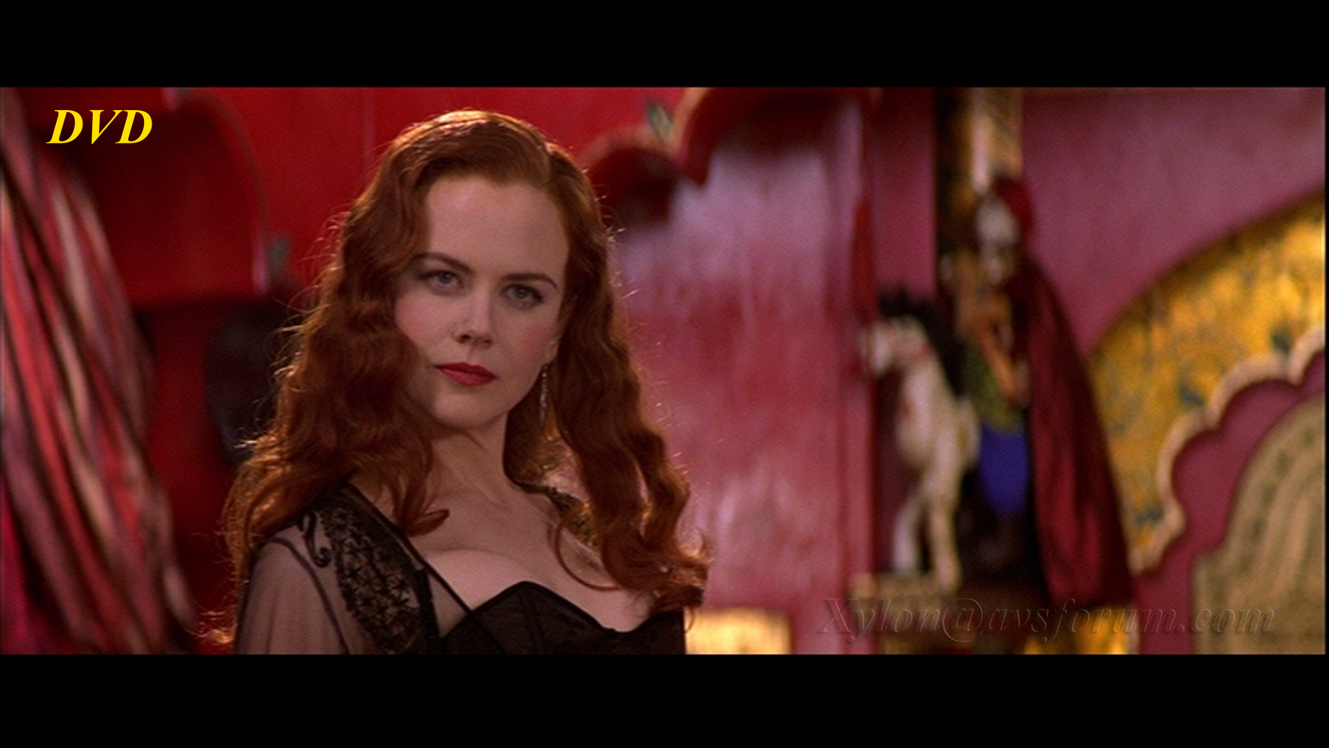
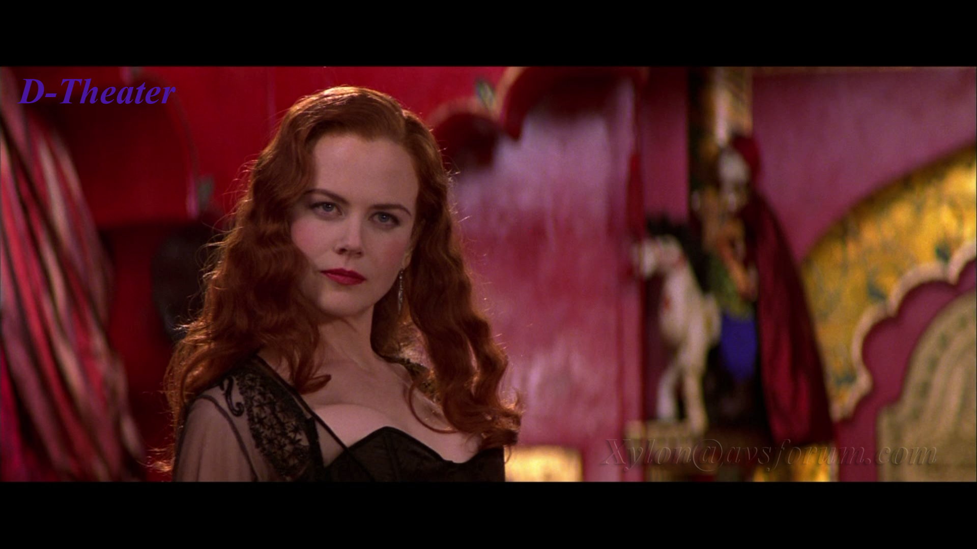
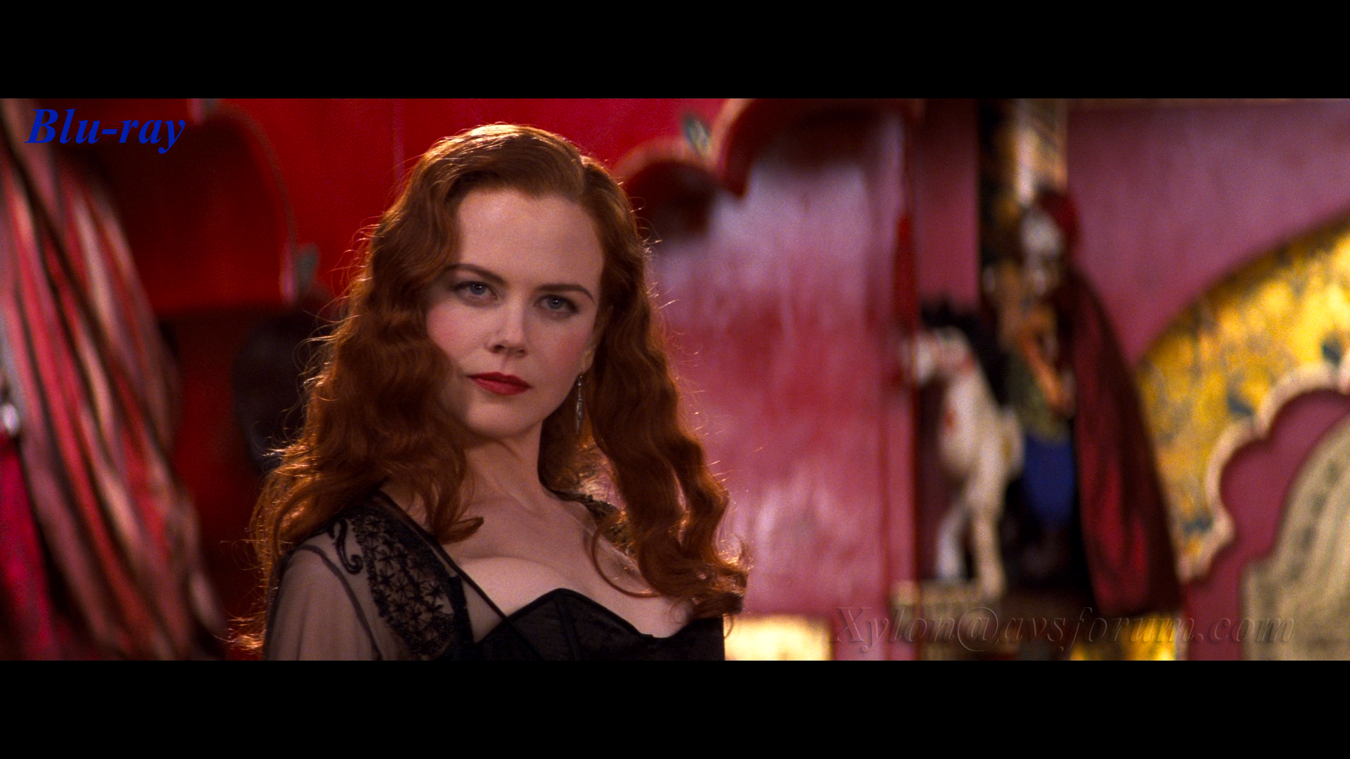
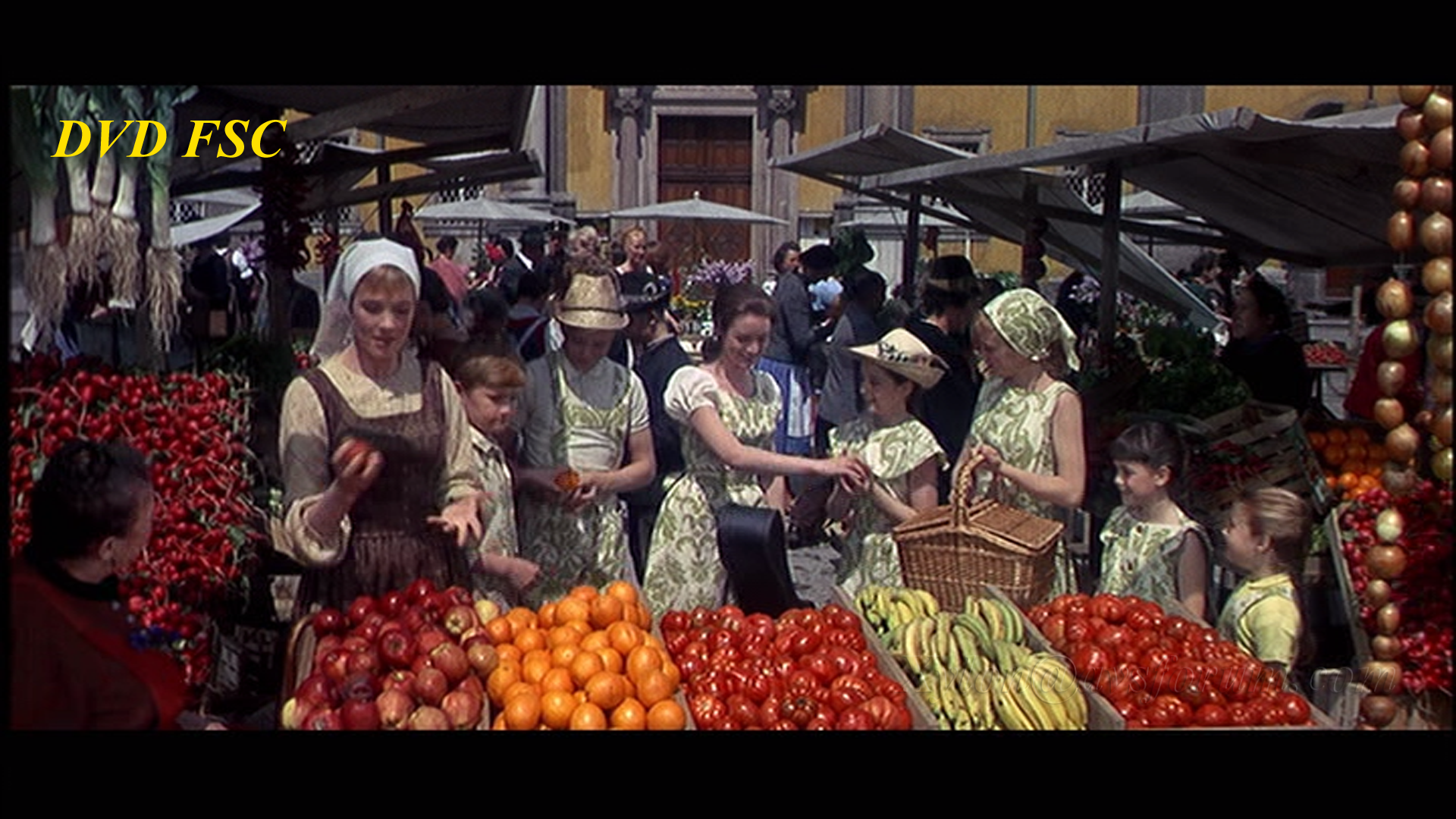
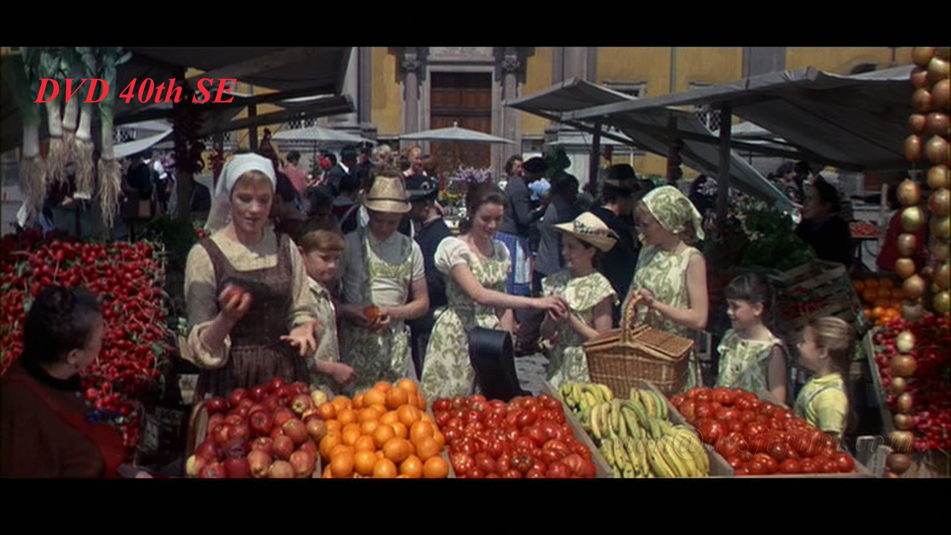
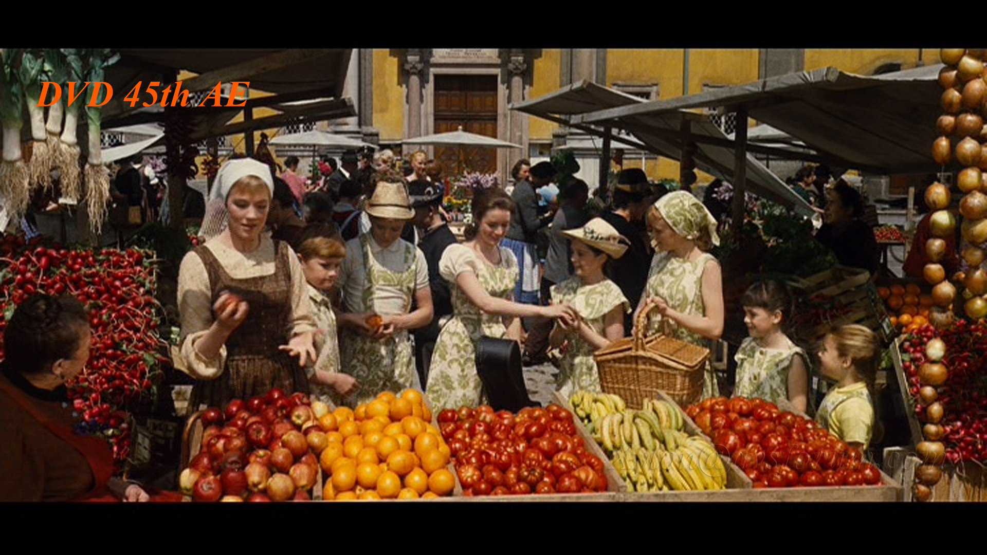
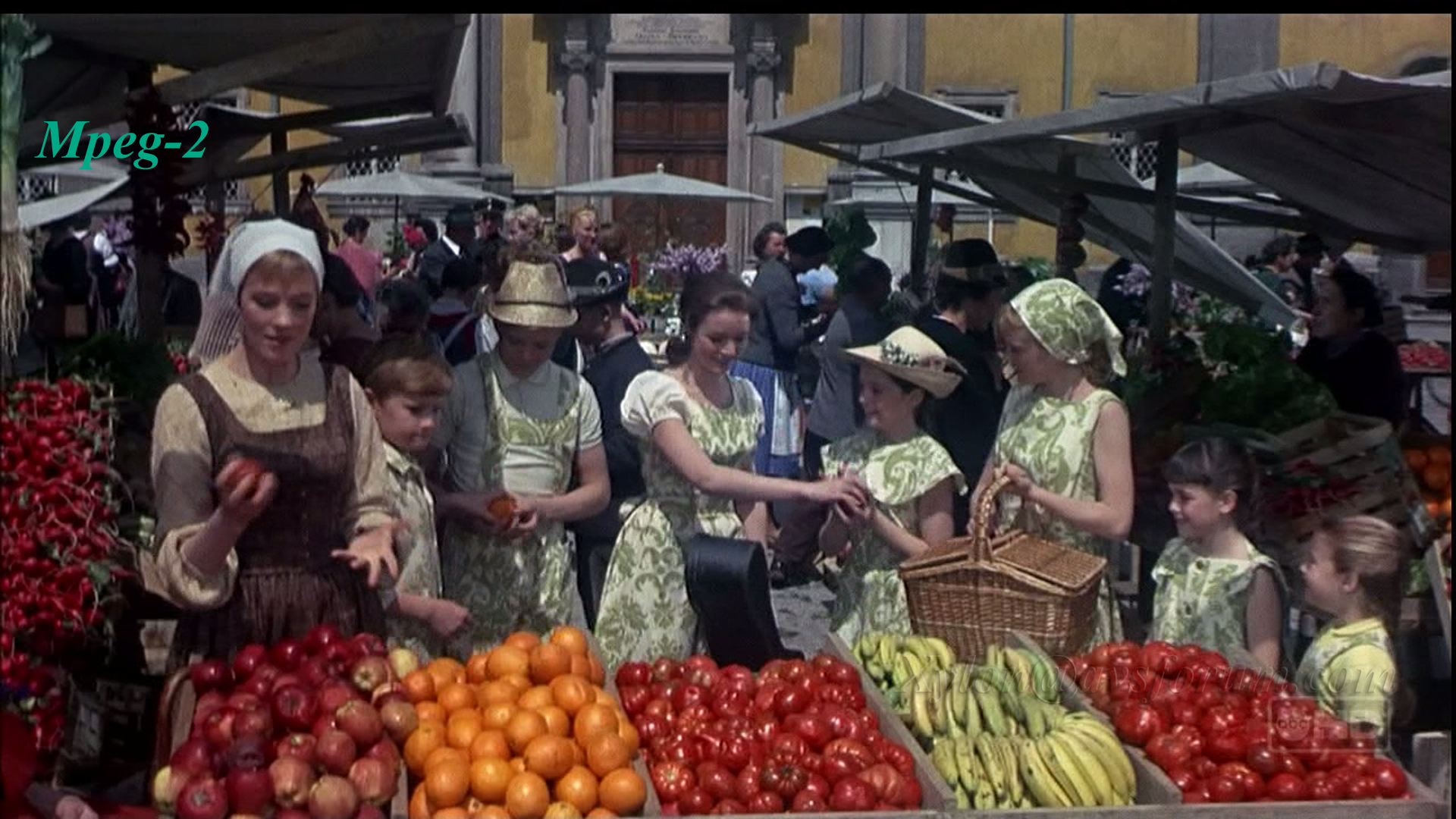
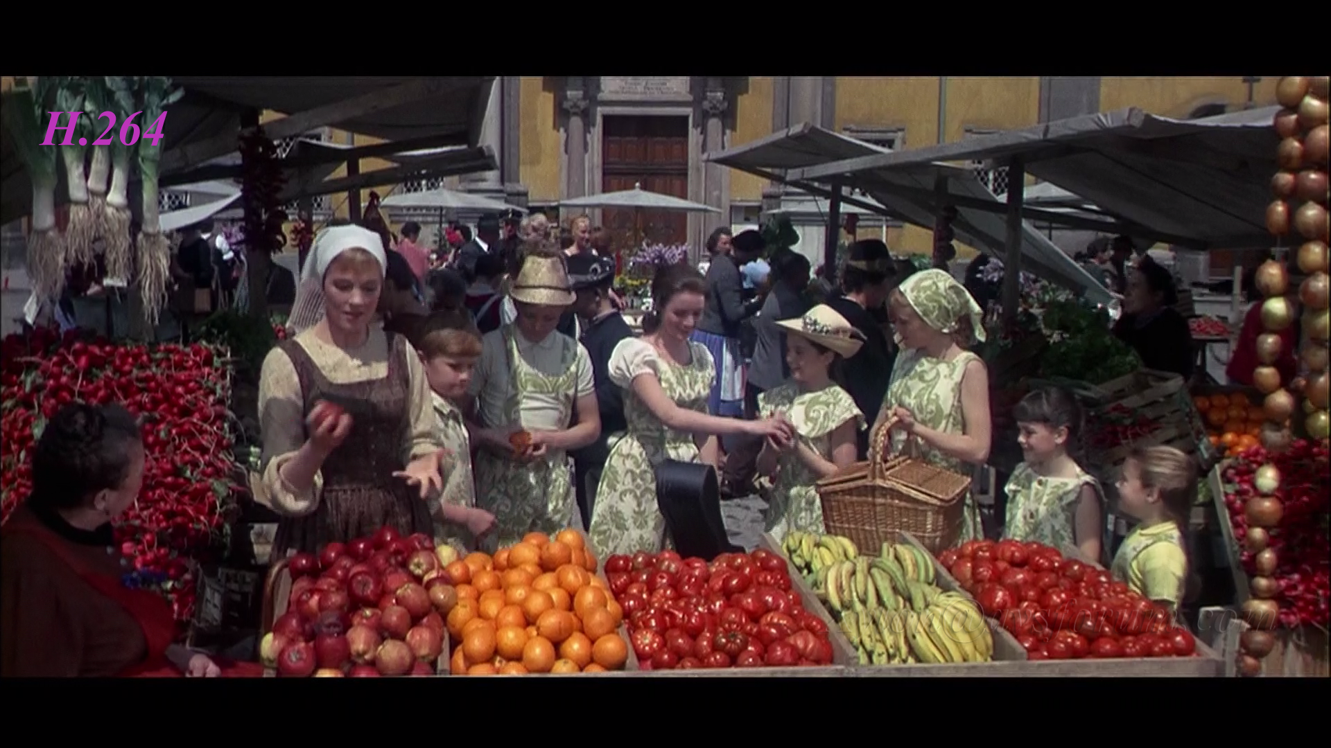
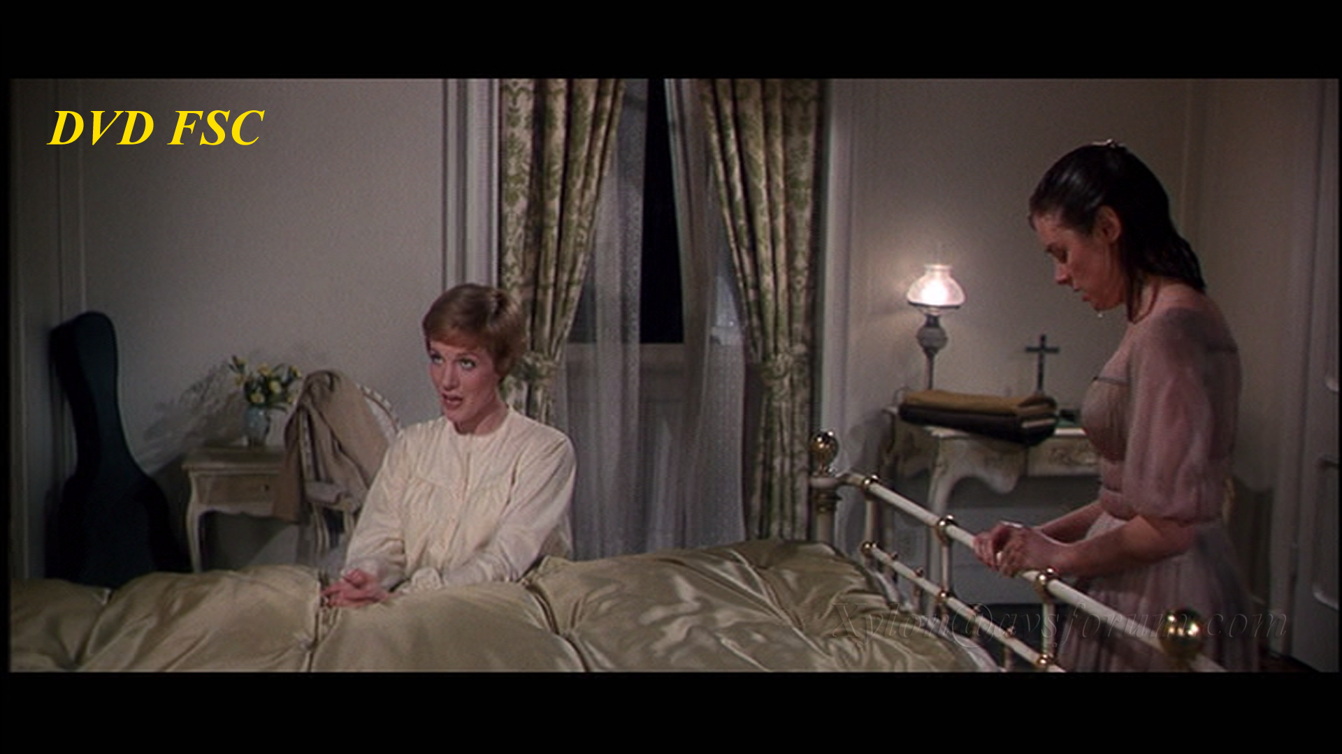
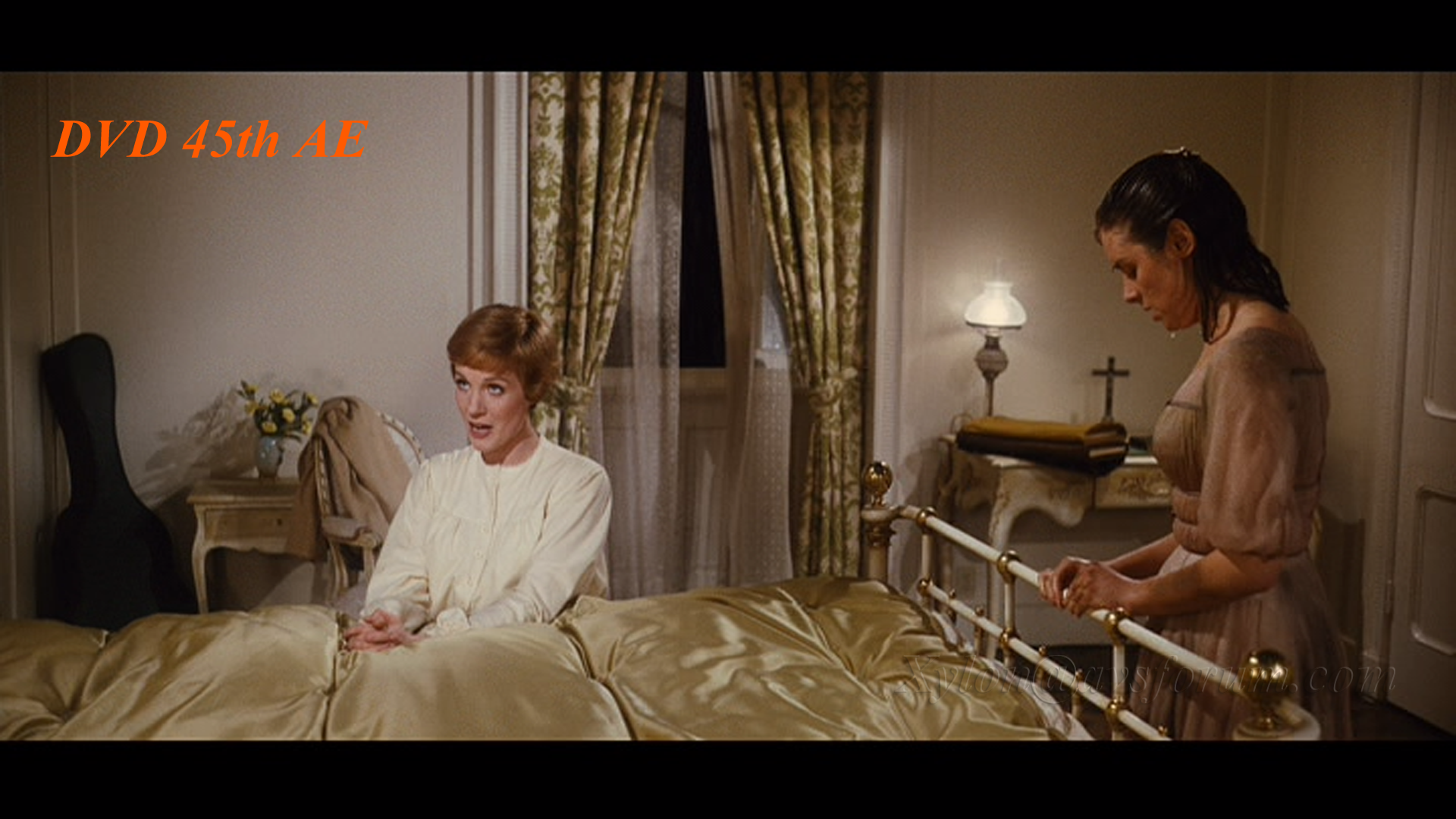
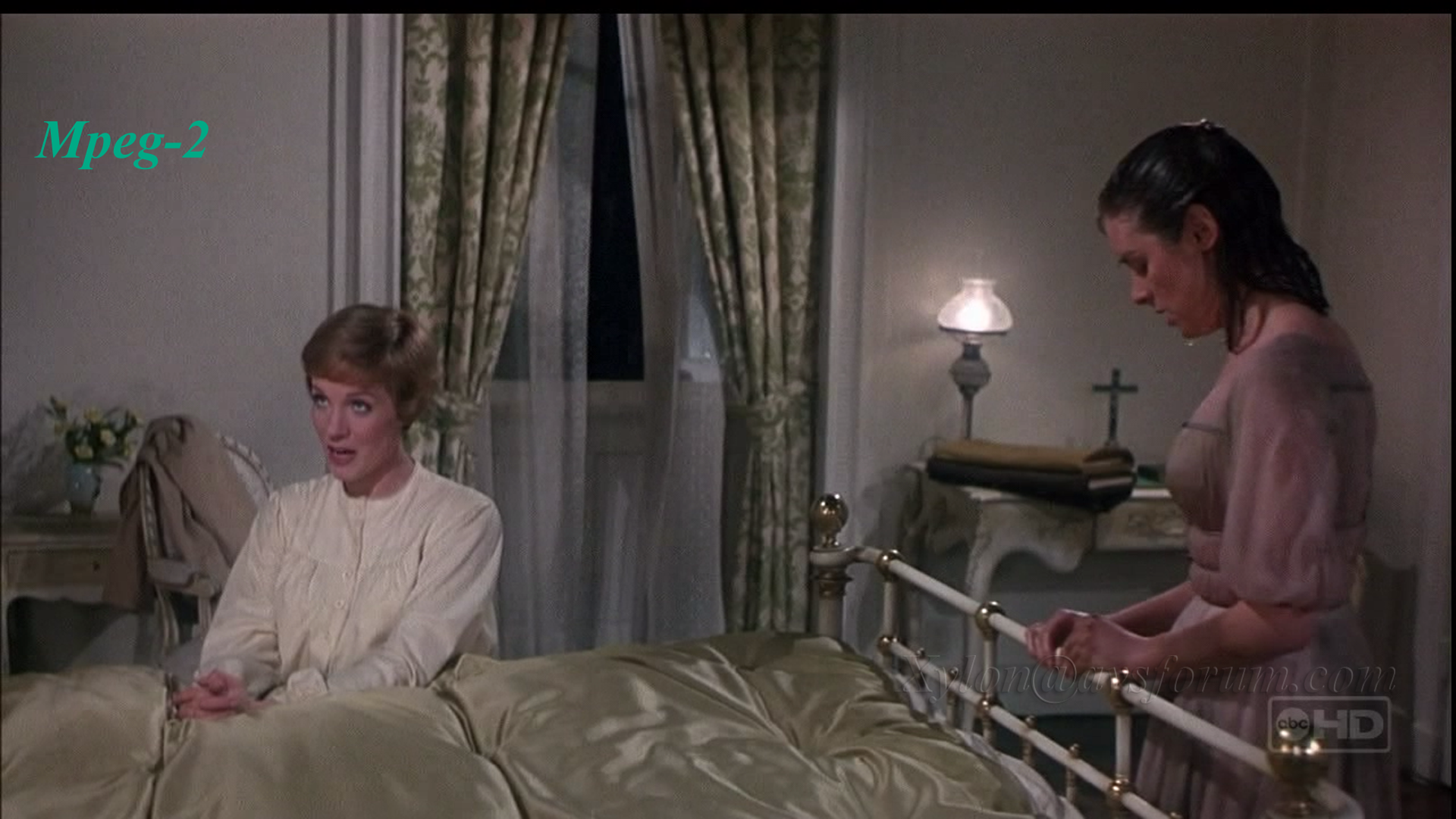
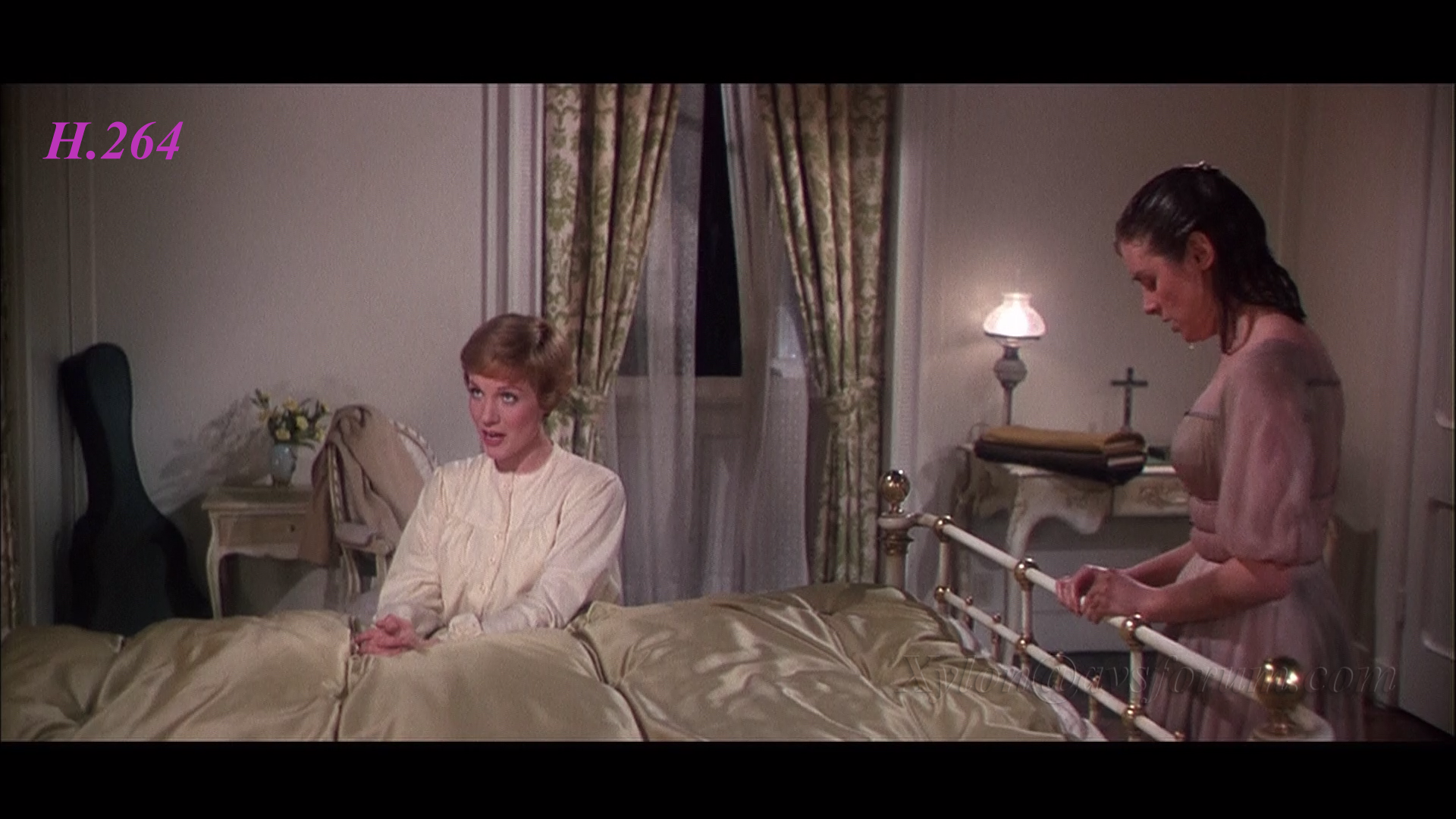
PQ: YRF have shifted from Shemaroo to Utech for the authoring of the BDs. Was that a good move? It is difficult to objectively comment on that as the source for this movie is not as pristine as new movies. Here are my observations and comments on what I liked and disliked on the PQ.

- Punchy and bright picture but more video like presentation.
- Black level – Good black level
- Shadow detail – Shadow detail is very good but only with dark to semi dark portions of the image (see issues with brighter areas later in the review)
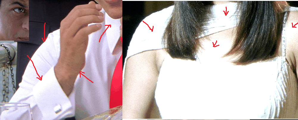
- Detail and definition is very good but marred by boosted contrast
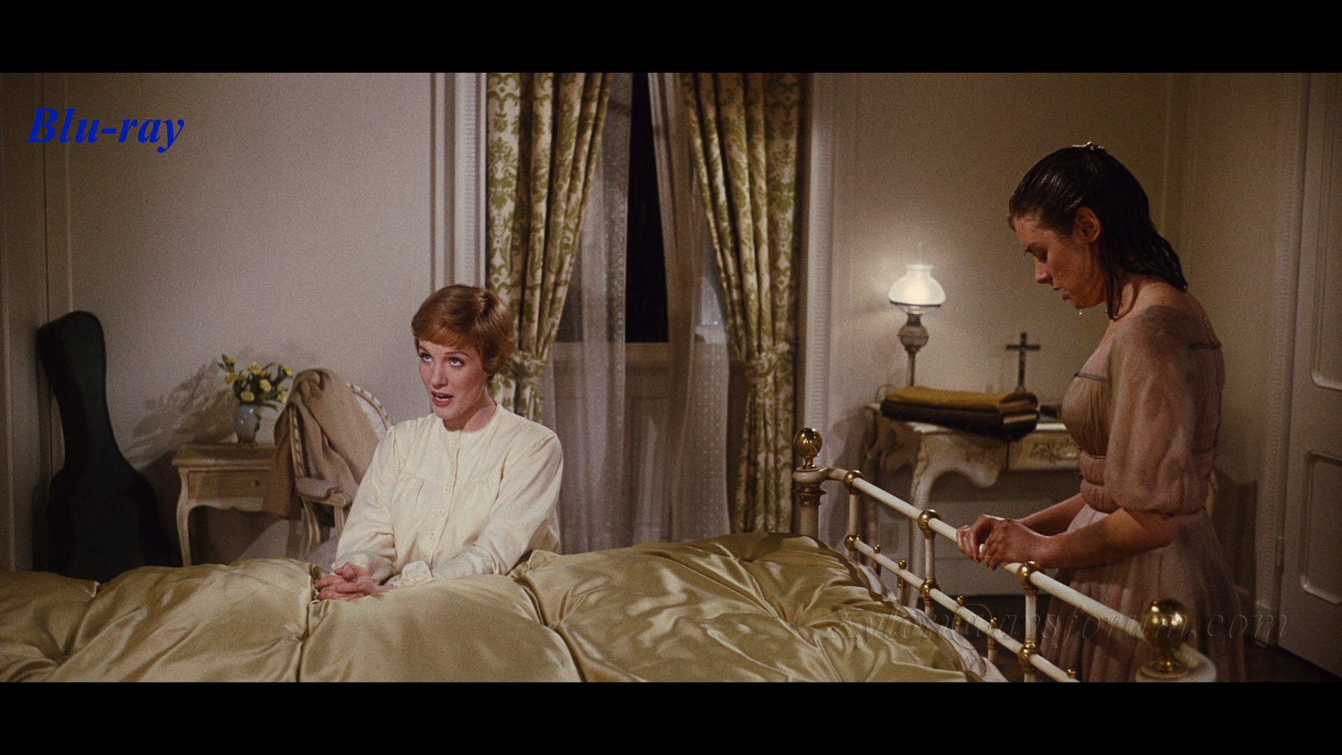
- Color - Many scenes bursts with color which is a treat to watch - the sagai party being one such scene...Costumes lighting and sets looks wow on full HD.
- Some scenes have great 3D effect
- Some scenes have great 3D effect
- No objectionable DNR although some scenes may appear bit mushy but it is due to high contrast banding and color gradient overlap of adjoining pixels or could be due to the camera focus.

I hate to write too many points in this section hoping each and every release from bollywood would improve. I know many people who have either seen this BD already or have commented on the SS have rated the PQ very highly but unfortunately I found the PQ to be lacking in some crucial departments.
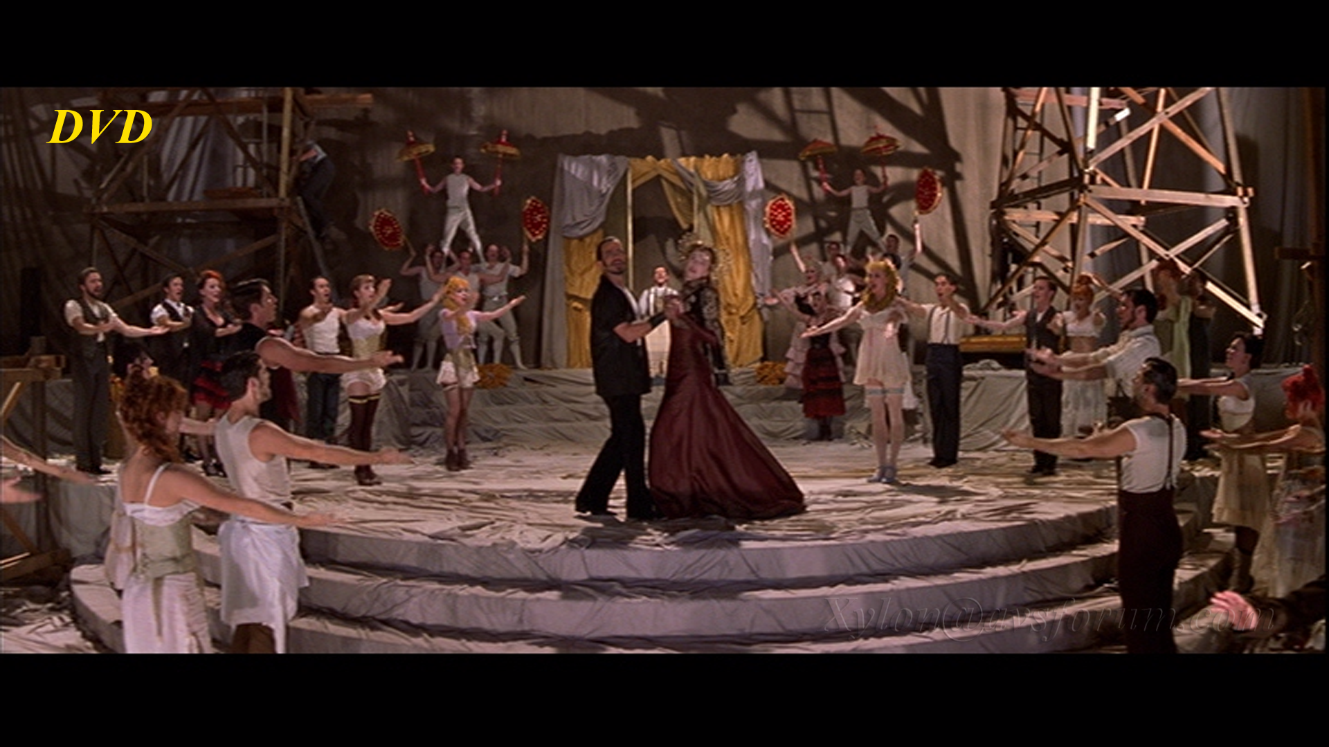
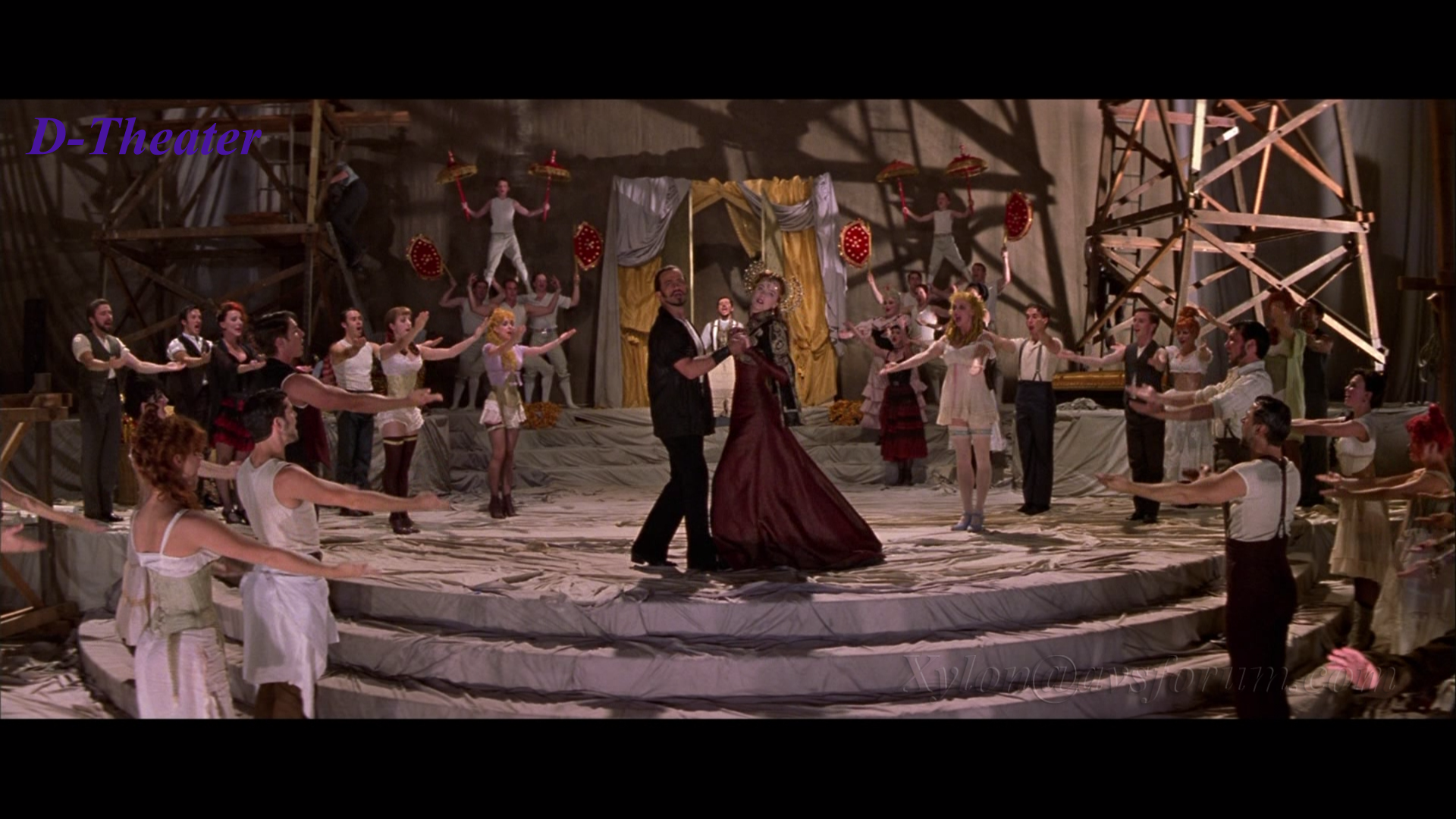
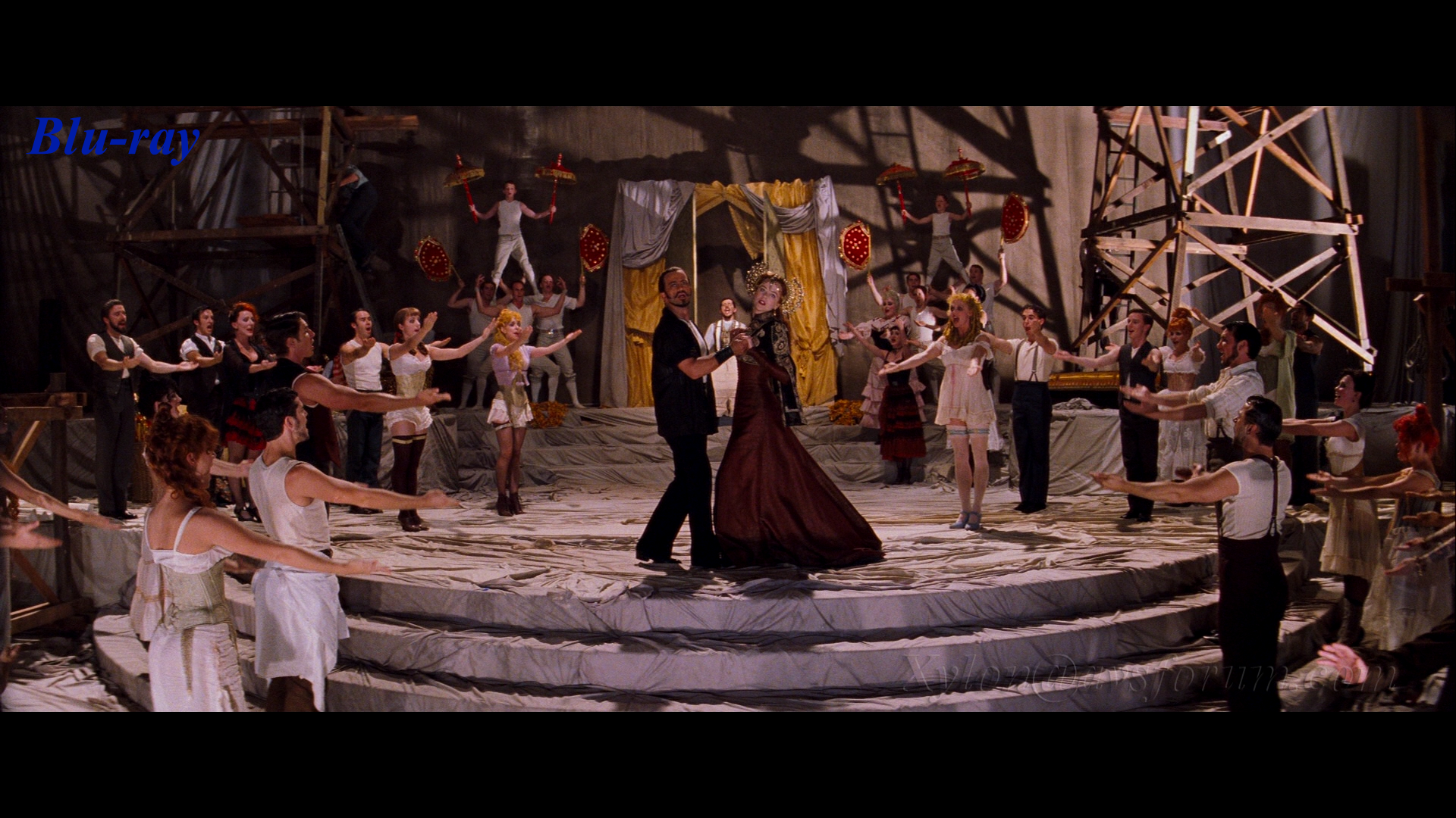
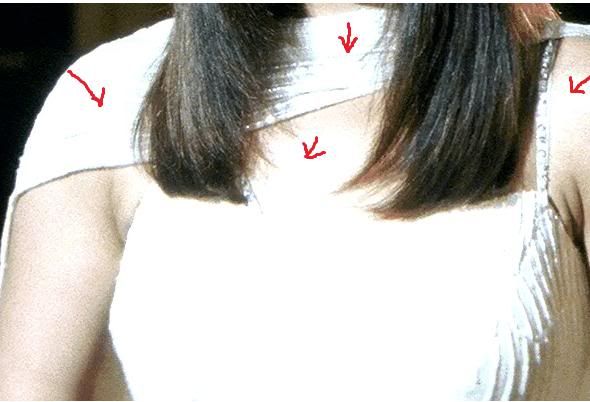
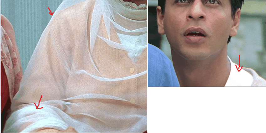
- White Level and Contrast – The biggest issue with this BD is the boosted contrast. I can’t fathom why Bollywood BDs are still authored with such high contrast robbing the picture from its natural film like look and loss of detail in bright areas. This is a crime and must be sorted out before popular titles like this one is released.
Honestly the white level is not acceptable. Blown out whites and yellows, contrast hotspots, hallows and banding can be seen in most scenes especially outdoor ones. I don’t have a PC based BD player to take screenshots but I am just using Raul’s SS potions to show the issue. They look really bad on a big screen. There are many scenes where this ruins the image. The effect is like introducing digital vibrancy to PC based displays. Due to high contrast the image also appears noisy (not to be confused with grain since grain is more uniform and granular than digital noise due to high contrast)
Look how it burns the image with high contrast. The image looks video like shot with a camcorder instead of a film like image. The details in white or bright areas are lost.
Suggestion: I had to turn down my contrast (white level) by 15 points to make it look better but since the contrast has already burnt those portions of the image you can’t restore them completely. To all who have watched this already and also to people who will be watching this soon – do yourselves a favour to reduce this effect for a better viewing experience.
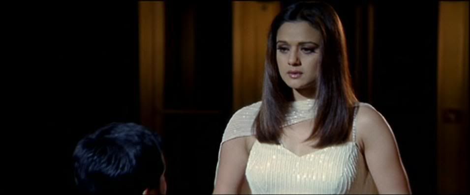
In your display make sure you have it set for movie mode or film mode and then open the contrast control and then reduce the contrast by at least 10-20 points based on the make of your display to reduce the effect of contrast burn effect slightly and make the image look filmic. I enjoyed the picture better after doing this. - Color – At first glance it might look great but if you look closely you will notice some color issues. Reds are not rendered well and the slightly colder color color temp makes it look off the mark. Some scenes exhibit strange skin tones like the one where Rohit and Naina gets married. The skin tones appear greenish yellow in normal daylight scene. The contrast boost in general makes the color bleed and burn in some scenes. Overall color is good in parts but inconsistent as well and I think a warmer color temp should have been used. Bright objects also suffers pinkish or bluish color tinge.
- Halos and Banding –The high contrast in the image produces halos and banding. One noticeable scene is the New York skyline scene where Naina confronts SRK after she finds out about his illness. A closer look at the NY skyline as the camera pans up and down display the halo and banding as it moves from a high contrast plane to a low contrast plane. Looks pretty bad. There are many such scenes. It also adds false contour around objects which loks ugly on a big screen.
AQ – DTS HD MA Track - Audio is very good but I expected better.
- Dialogues are crisp and clear and the center speaker is well used
- Songs and background score in general makes the sound track come alive.
- There is a sound distortion problem in parts of the movie where the rears squeak at times. The beats just before the interval and later when SRK goes to meet Saif on the rooftop in the 2nd half creates a cracking sound even at low volume. This is very poor authoring.
- There is a lack of refinement in the high frequencies and midrange in the track and other orchestrated sequences which is a slight letdown.
Summary:A nice and entertaining movie which has a good value. PQ might look great and punchy on a smaller TV but on a big display above 42 inches, some of the issues become more apparent to people who care about true picture quality. To me, contrast boost is the biggest problem in this BD. Color inconsistencies though present wouldn’t have looked that bad if the contrast was taken care of.
I don't know if the PQ issues are replicated from the source DPX or due to the authoring done by Utech. I have not seen contrast issues with Shemaroo's authoring but their BDs have colder color temp. I I have to choose between two bads - wrong color temp and blown contrast, I'd choose wrong color temp since it can be tweaked and blown contrast cannot be corrected at all.
On the AQ side, the DTS HD track sounds good but could have been better with some refinements in the high and mid range. The distortion in certain places is a sign of poor quality which authoring houses must sort out before release and is not acceptable.
Suggestion to Studios and Authoring housesI am noticing a standard trend in most Bollywood BDs in terms of color issues. At the source creation stage (DPX) or authoring stage (if applicable) it seems that the correct color parameters are not used while processing. I heard from a source of mine that the sources are processed for digital broadcasting due to heavier demand of movies to be shown on TV. Color parameters used for HDTV or Digital TV broadcast is slightly different from BD spec. Using a HDTV/DTV processed source for BDs will not result in the right color. Members who are in US, UK and other western countries must have seen that HDTV versions of the movies differ slightly to the BD version in terms of color temp and tone. This issue was there with many early Hollywood BDs where the color looked closer to HDTV/DTV. Many titles were re-mastered with correct color processing.
I am not sure if this is the case with Indian BDs but this needs serious attention before all good titles are released in BD with wrong color parameters.
RatingMovie: 4.0
PQ : 3.5 (sorry, but I can't tolerate contrast boost in Bluray so can't rate this any higher)
AQ: 4.0
My Value score: 4.00